Brooks Running
The Why Behind Brooks’ Redesign
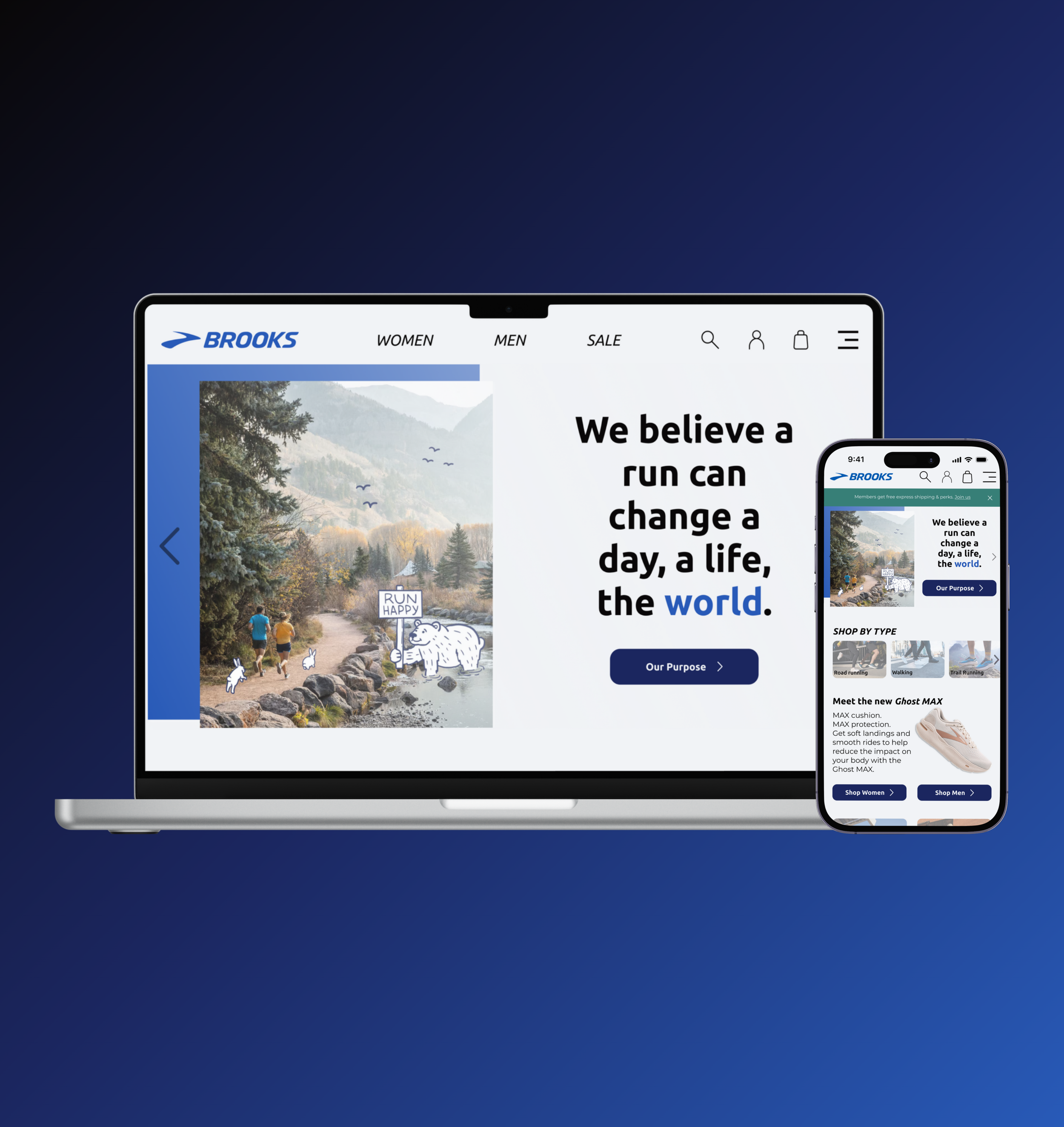
Motivated by Brooks Sports, Inc.'s commitment to crafting exceptional running gear for a diverse range of runners, my team undertook on this redesign. Inspired by the RunHappy campaign, I aimed to enhance brand loyalty and explore the world of eCommerce through the redesign.
My Role
UX Researcher
UX Designer
UX Writer
Team
Ciana Froemming
Mik Pauser
Ombria Kent
Laynette Padron
Cassandra Whitley
Tools
Figma
Framer
Canva
Google Suite
Problem
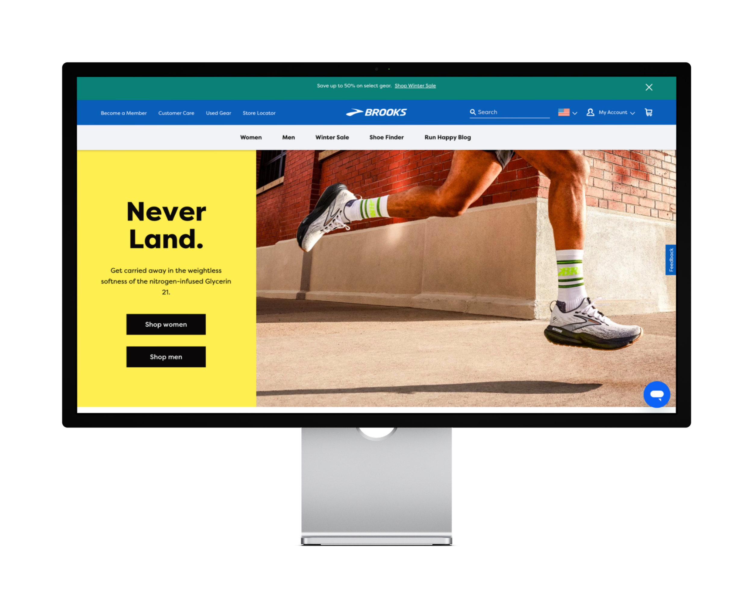
Brooks Sports, Inc. has gained notoriety through their well designed running shoes and other products. However, runners find their website to be lacking brand loyalty and an effective user experience.
Solution
Customers of Brooks Sports, Inc. will enjoy an enhanced experience as I optimize brand guidelines by integrating the RunHappy theme for a personalized touch, and redesign the product listing page to clearly convey the purpose of each running shoe on the website.
-
Goal 1
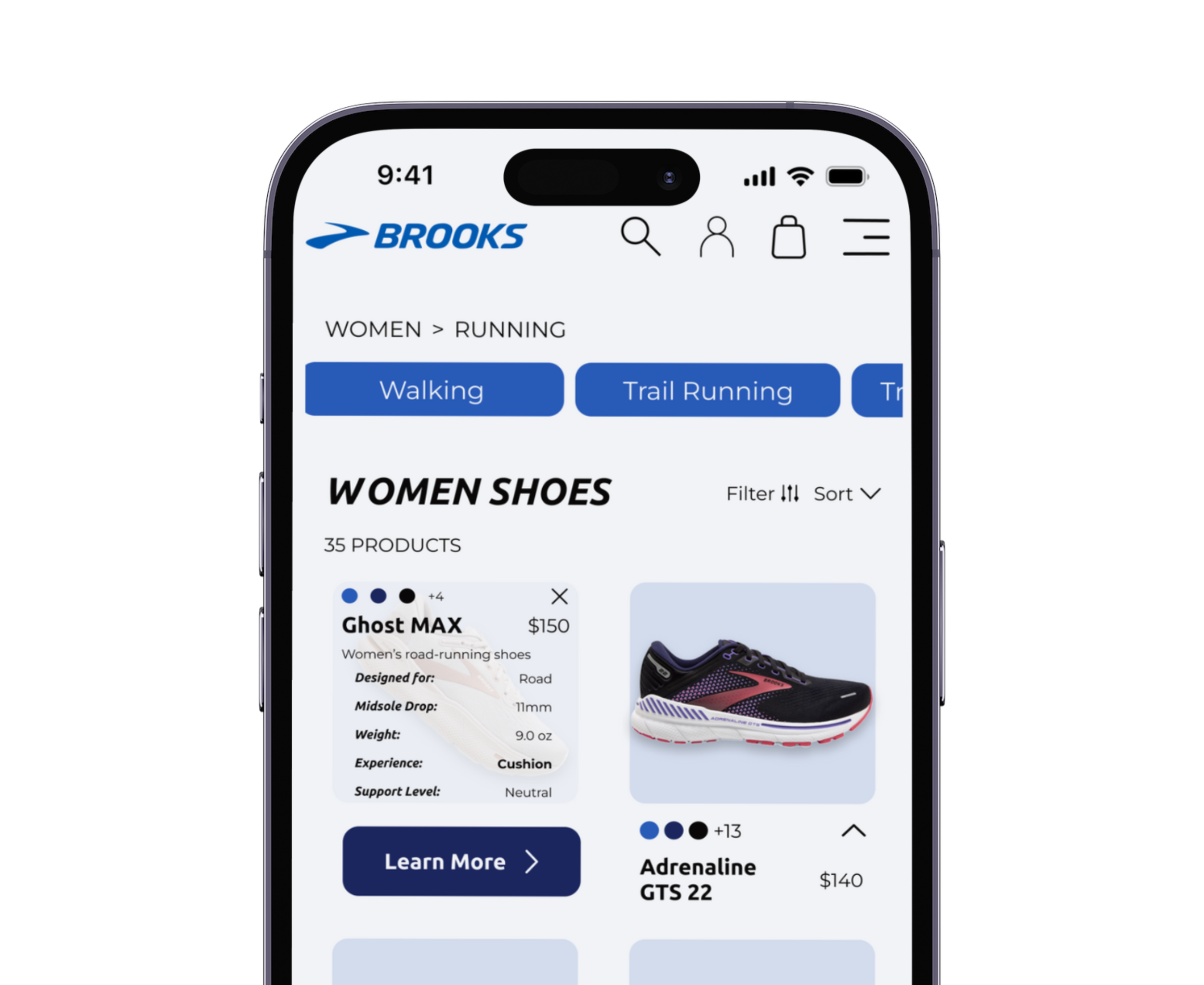
Add the purpose (specs) of each shoe on the Product Listing Page
-
Goal 2
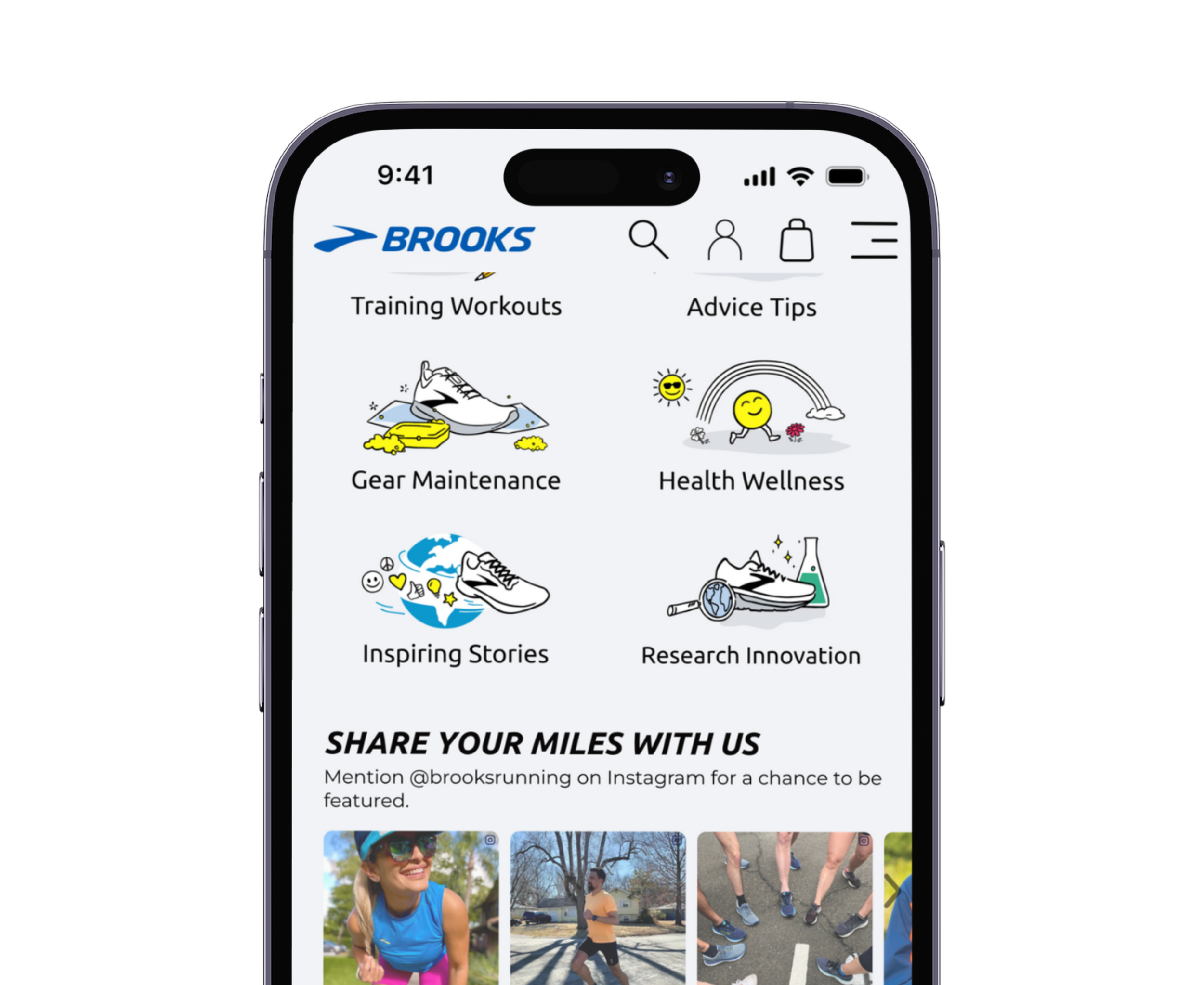
Make the users feel a personal connection to the brand
-

Goal 3
Follow consistent brand style guidelines
User Interviews
I interviewed five individuals who identify as both runners and non-runners to uncover needs and pain points that potential Brooks Running users face when shopping for athletic apparel.
I focused on two key topics during the interviews:
How do users shop for athletic apparel?
What barriers do users face when shopping for athletic apparel?
User Pain Points
Overwhelmed with the amount of athletic shoe brands
Finding shoes that meet all comfort and size needs
Not knowing what product is best for each type of athletic activity
Dustyne P.
“It’s important to feel comfortable & supportive [in shoes] to preform to the best of your ability."
Usability Testing
I conducted 5 usability tests on the current Brooks website to identify user pain points. Each user was asked to complete the following 4 tasks.
Starting on landing page, add Glycerin StealthFit 20 to cart
Find information about the Women's Ghost Max
Find Women’s Luxe Hoodie & add to cart
Proceed to checkout (stop at shipping method)
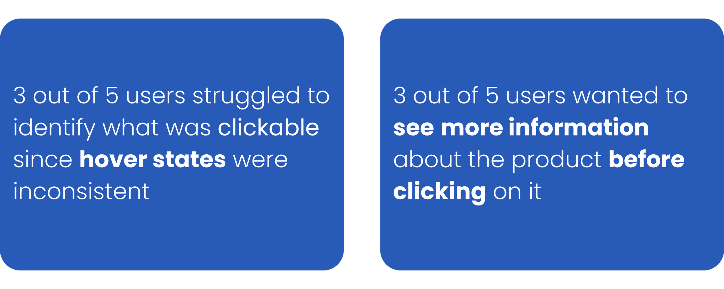
Notable Pre-Redesign Usability Testing Results
Survey Insights from 24 Responses
I also decided to conduct a survey to gain a better understanding of what runners and people who tend to live an active lifestyle look for when choosing their athletic shoes and apparel.
Knowing 45.8% prefer online shopping for athletic wear informs my redesign strategy for the Brooks website, ensuring an improved website design will make the online shopping experience at Brooks more user friendly.
54.2% prioritize cushion, stability, and ground feel when choosing what athletic shoe to buy. Knowing this helped me tweak the website so that these priorities are visually easy to identify.
Heuristic Evaluation
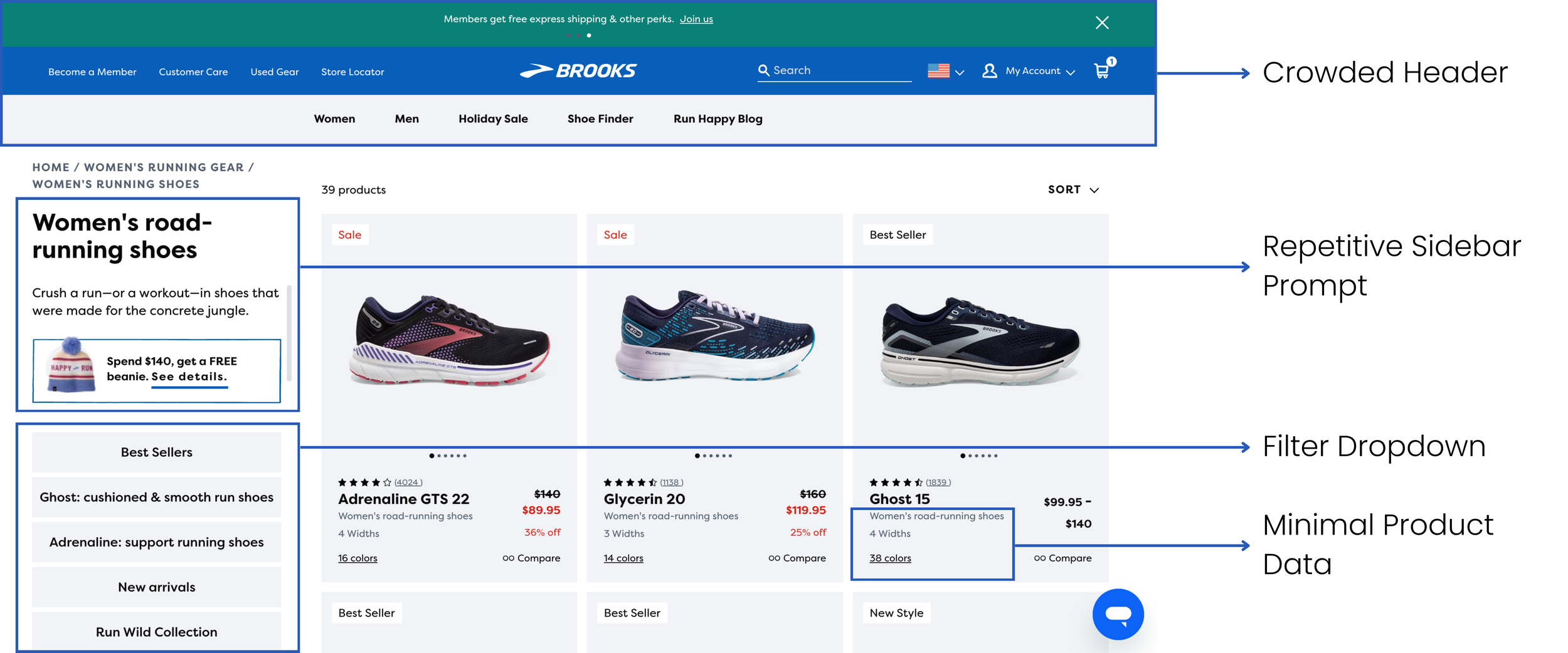
I conducted a heuristic evaluation of Brooks' current site, revealing a crowded nav bar and a filter dropdown occupying nearly a third of the page. This space could be utilized to showcase more products or enhance readability by enlarging product cards.
Additionally, I noted minimal shoe descriptions, a concern raised in the initial usability test.
How might we establish a more cohesive brand identity and intuitive interface through our redesign?
Meet the Competitors
I analyzed two direct and two indirect competitors to understand their strengths and weaknesses compared to Brooks.
Direct Competitors
On Running stood out for its user-friendly minimalist design.
Hoka impressed me with a detailed hover state on their PLP.
Indirect Competitors
Dicks Sporting Goods offered ample information for customers on their PDP.
Lululemon’s PDP had great informational hierarchy.
Feature Ideation
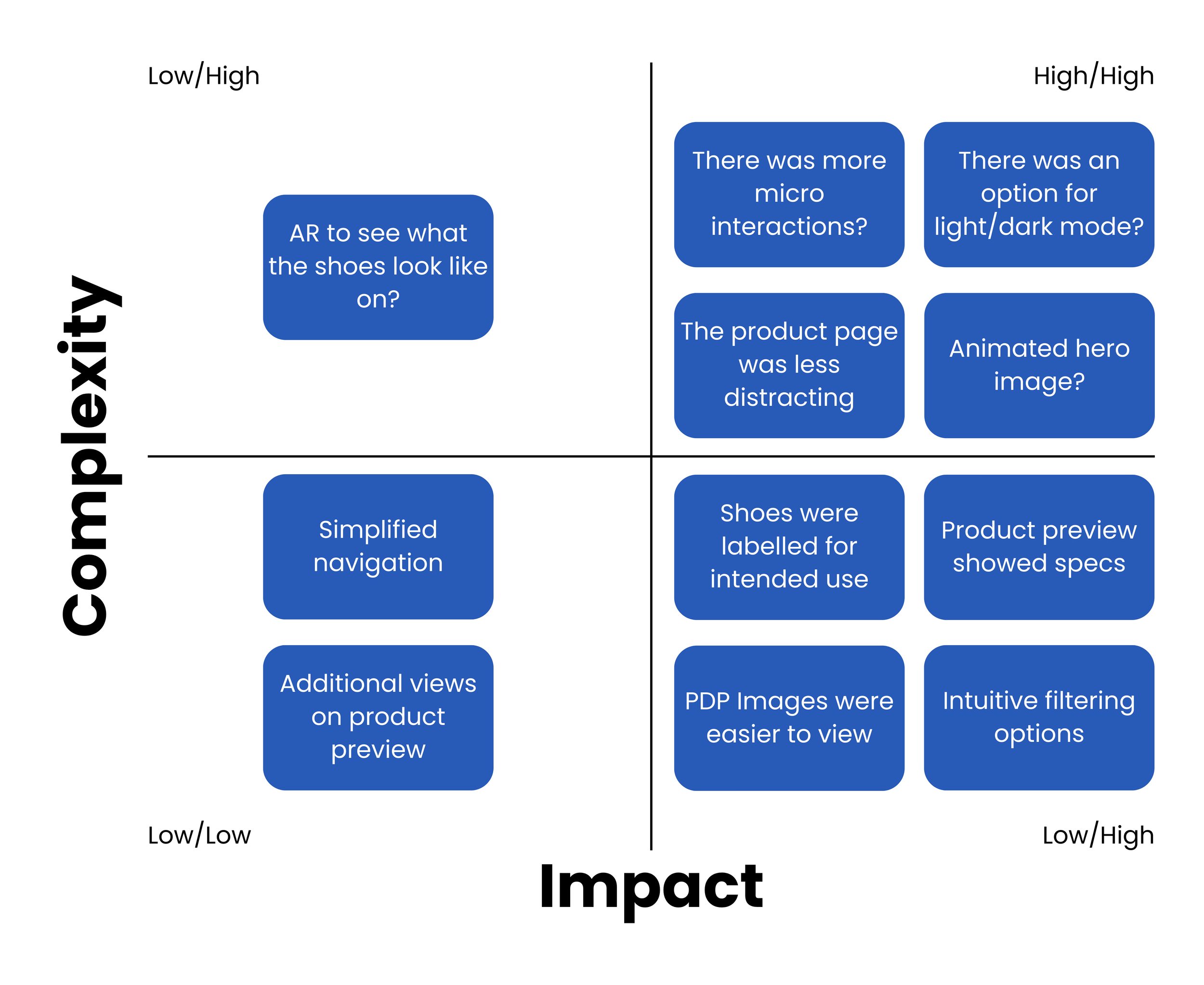
In the feature ideation process, I utilized the I Like, I Wish, What If... exercise to generate diverse aspects for the redesign, drawing insights from both user interviews and usability testing.
Following this exercise, I prioritized features by emphasizing high user impact coupled with low implementation complexity.
This strategic approach allowed me to select elements that offered the most efficient path towards achieving my redesign goals.
Sketches
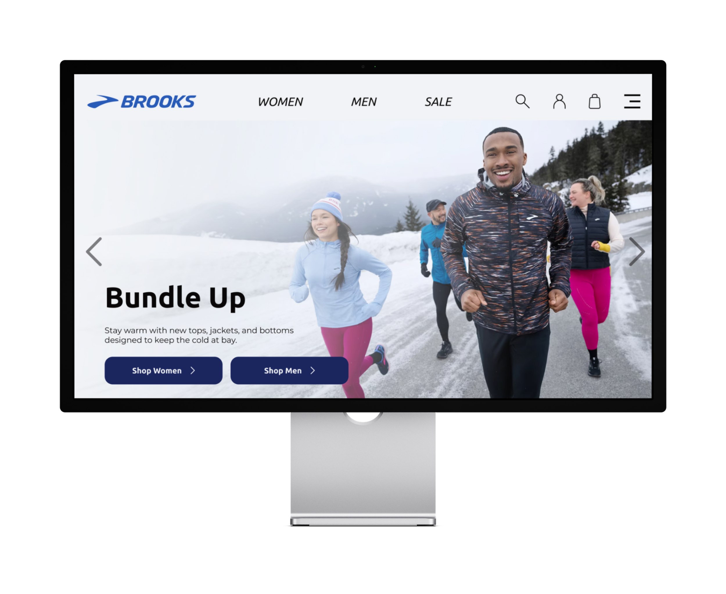
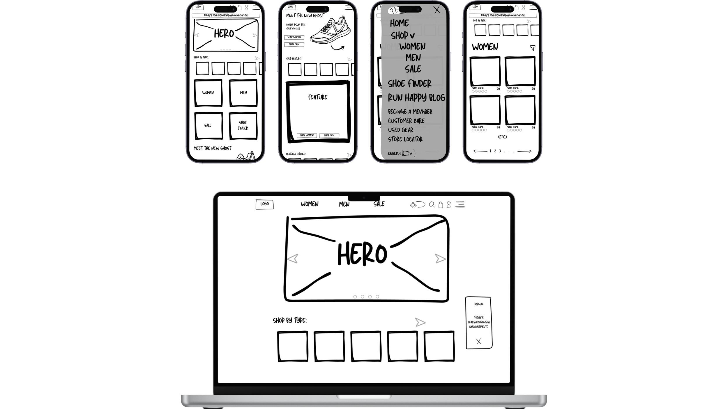
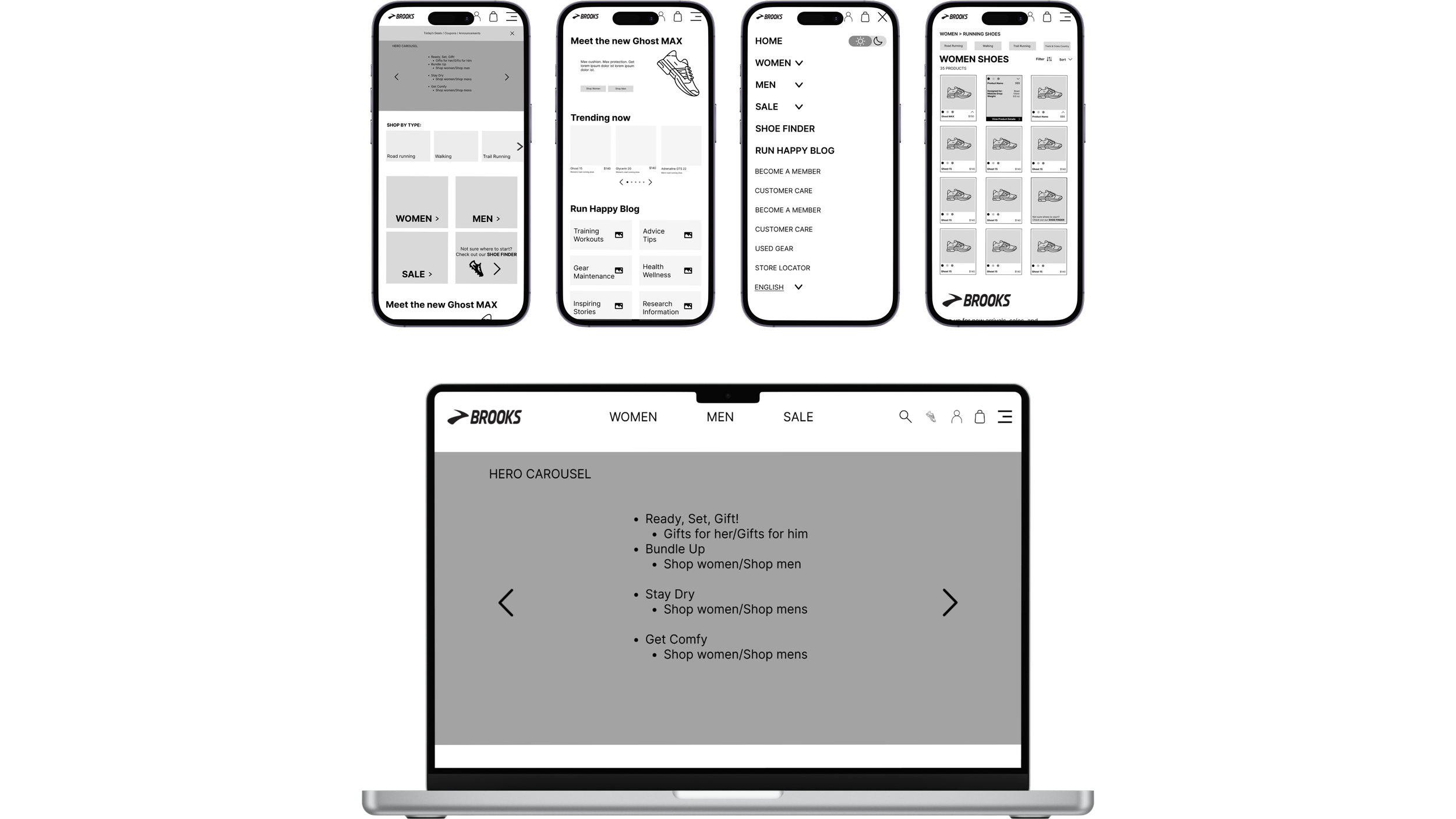
Each team member drew out sketches of our ideal redesign. My team landed on the sketches made by UI designer, Mik. Her design encompassed our thoughts perfectly with a simplified nav bar and hero carousel.
Wireframes
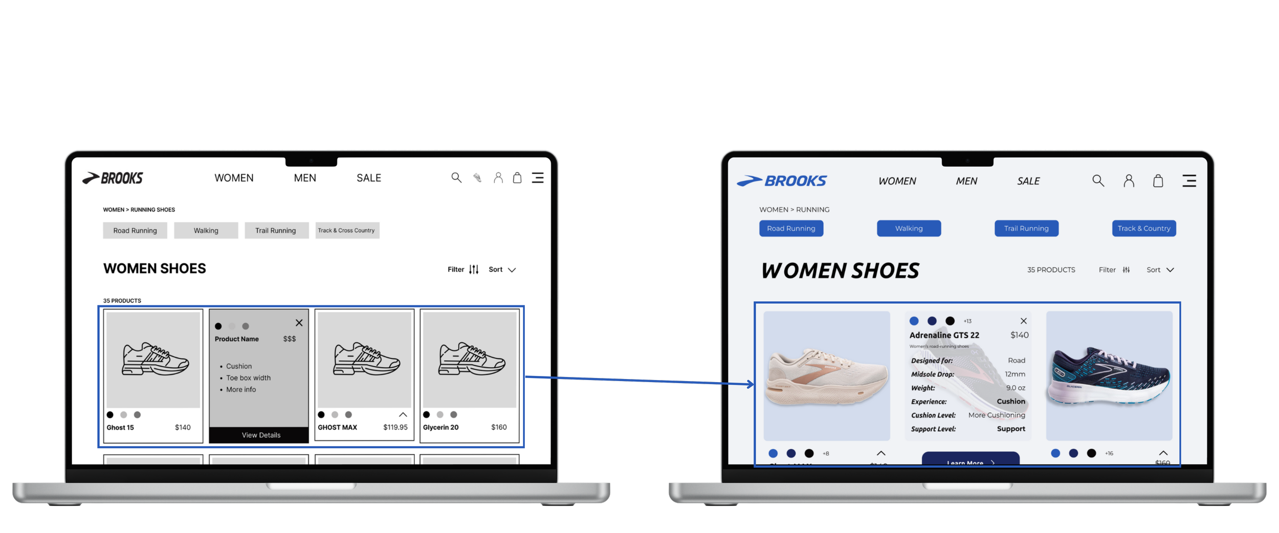
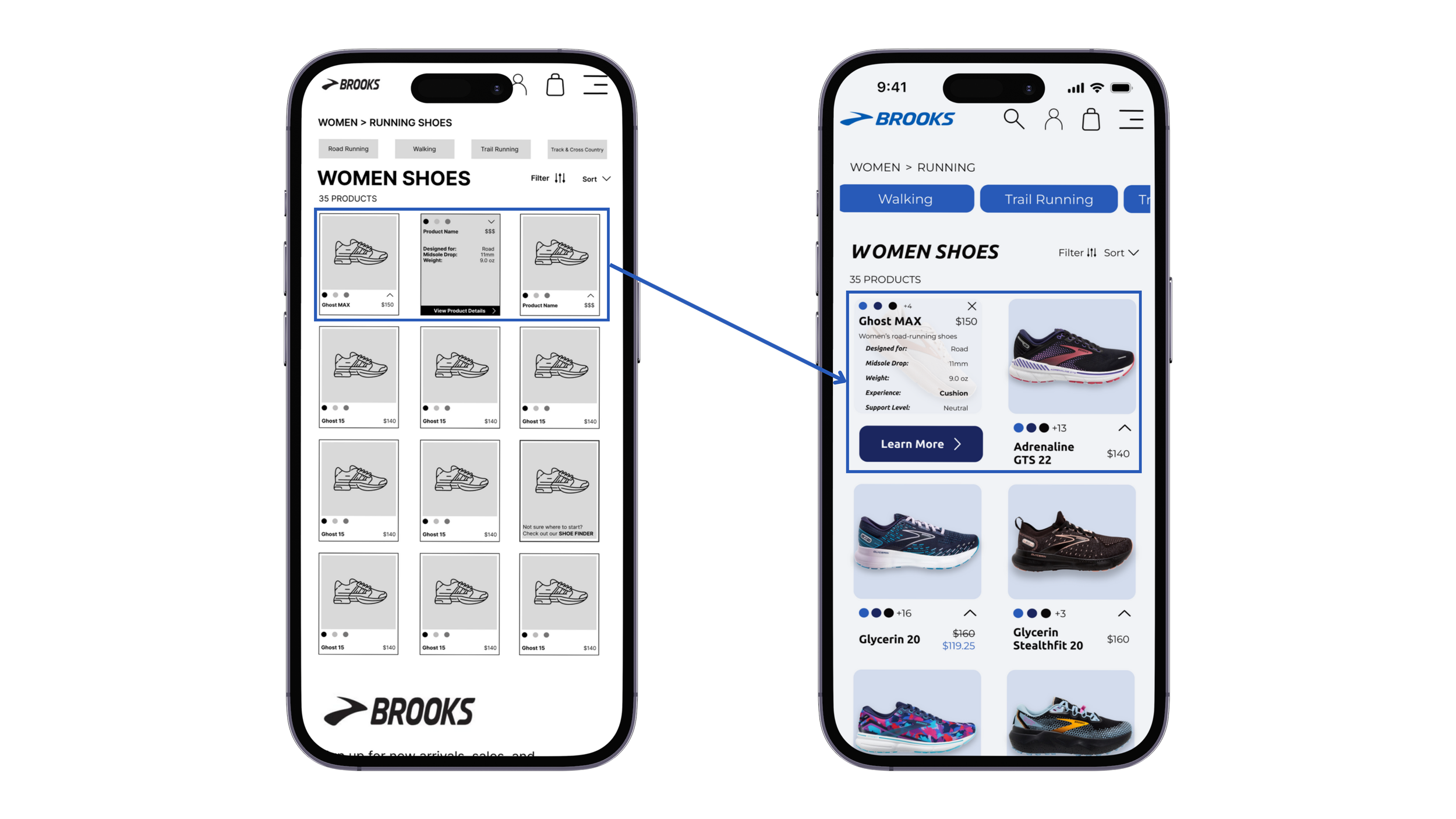
As a team we aligned our low-fidelity wireframes closely with our sketches to conduct insightful usability tests. This then helped us identify necessary iterations for the high-fidelity prototype.
Time for a Test Run
Five users completed usability tests on the redesigned wireframes for mobile and desktop.
Usability Test Goals
Identify pain points in the user flow
Assess the new layouts for the landing page, product listing page (PLP), and the product detail page (PDP)
Our Runner’s Feedback
4/5 users
said the PLP cards were too small to view and read
5/5 users
said the carrot to show shoe specs was too small to click on
Iterations
3 columns of products to 2 columns of products
Increased text size on product specs
Enlarged carrot icon & "learn more" button
Added hover micro interactions to catch customers attention
Running to the Finish

The Final Test Run
After creating the high fidelity prototype, I conducted one more usability test.
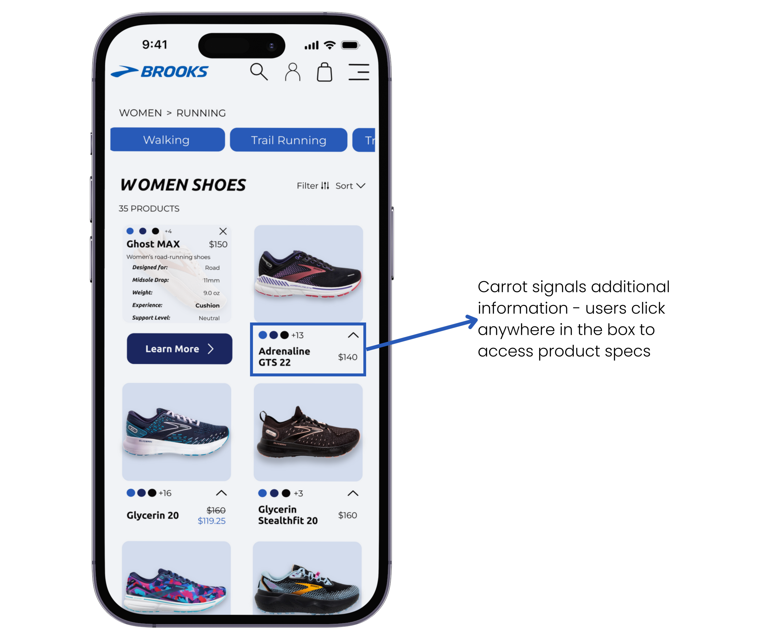
2 out of 5 users found it difficult to click on the carrot in the PLP, a concern raised consistently in both low and high fidelity tests.
To address this, I made the entire bottom section of the product card clickable. Now, users can click on the carrot or the product name/price to access the product specs.
Jack J.
“Oh wow! This is so nice seeing the quick facts about the shoe without clicking on it. I wish this was on all sites!”
Calista F.
“I loved the small details in the animations. It makes me excited to keep shopping at Brooks!”
The Future of Brooks Running
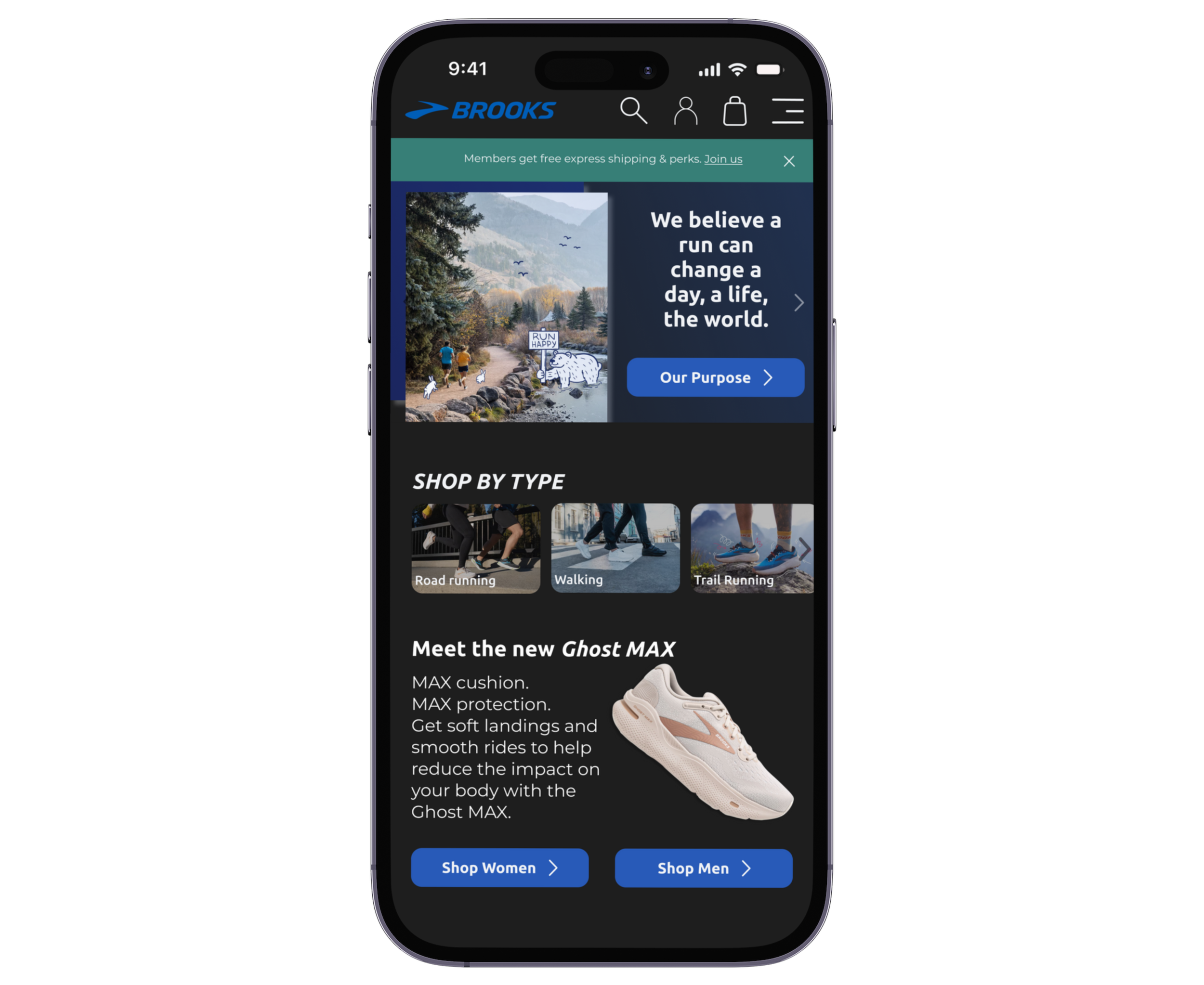
First iteration of a dark mode prototype
In the Brooks Sports Inc. website redesign, analyzing my research sharpened my focus on creating brand loyalty and optimizing information display for a better user experience.
Looking ahead, I aim to:
Enhance the navigation menu by simplifying options
Refine the footer by incorporating the top navigation categories
Introducing a dark mode version of the website.
Capitalizing on the growing popularity of dark mode, I believe this addition will set Brooks apart from competitors and draw attention to their brand.
Final Strides
The redesign of Brooks Sports Inc.'s website marked my exciting entry into the world of eCommerce.
This project emphasized the importance of maintaining brand integrity, exemplified by Brooks' RunHappy, alongside prioritizing user-friendly experiences to cultivate brand loyalty and enhance reputation through authentic user endorsement.
In addition, this project taught me the importance of addressing user pain points, conducting competitor analyses, and empathizing with our user persona, skills that will remain central in my future UX endeavors.

