
Highpoint Center for Printmaking
The Why Behind Highpoint’s Redesign
Highpoint Center for Printmaking, a vibrant Minneapolis nonprofit, fosters printmaking through educational programs, studio space, and galleries. My team aimed to revitalize Highpoint's website, supporting local growth and helping artists connect within their ideal creative space.

My Role
UX Researcher
Content Writer
UX Designer
Team
Ciana Froemming
Ryan Kennedy
Maneli Aygani
Ann Truong
Tito Liv
Tools
Figma
Adobe Photoshop
Google Suite
Problem
Struggling artists need to find adequate and affordable studios that provide them with the necessary resources, classes, and workshop space because it is essential for their creative pursuits.

Solution
To aid struggling artists, we'll revamp Highpoint with improved navigation, streamlined donations, and a refreshed brand to boost user experience, support, and identity.

-

Goal 1
Seamless donation process
-
Goal 2
User-friendly navigation
-

Goal 3
Update brand colors, font & showcase artist work
Interview with Highpoint
During an interview at Highpoint, our User Researcher, Maneli, engaged with the Communications and Development Manager to uncover Highpoint's current website challenges and objectives. The following quote encouraged us to explore how users find current classes through the website’s navigation and wording.
— Jenny Wells, Communications & Development Manager at Highpoint Center For Printmaking
“I think most people are trying to figure out exhibitions and classes, more than anything else. Which that's maybe also an issue right now as it's not really obvious, you have to dig to find classes."
Usability Testing
In our initial usability test with five users, we studied their behaviors, thoughts, and navigation, pinpointing areas for redesign improvement.
Usability Test Goals:
Discover what Highpoint is about & identify the 5 programming areas
Find & select “one-time donation”
Select “Schedule a Class” page & find the class “Stencil Monoprint”
Pre-Redesign Usability Test Results
-
3 out of 5 users
found the "Support Us" page confusing because of the formatting
-
4 out of 5 users
found the search bar & they felt that nav bar menu had unclear titles
-
4 out of 5 users
struggled to find the mission statement
How might we improve Highpoint for struggling artists through better navigation, streamlined donations, and a refreshed brand, supporting their creative needs?
Palette of Priorities

After conducting usability tests on the original site, we used an affinity diagram to identify user pain points. This informed our feature prioritization matrix, helping us focus on the most critical issues for the redesign.
After seeing that our users were struggling with the top navigation during usability testing on Highpoint’s pre-redesign website, we decided to conduct a card sorting exercise to optimize the organization, making it easier and faster for users to find the information they need.
The Sitemap was created following the card sorting and used as our blueprint throughout the entire design process of Highpoint’s navigation.
Mapping the Online Canvas
Card Sorting
Problem: Long list of names and misleading support us button on the original Highpoint website.
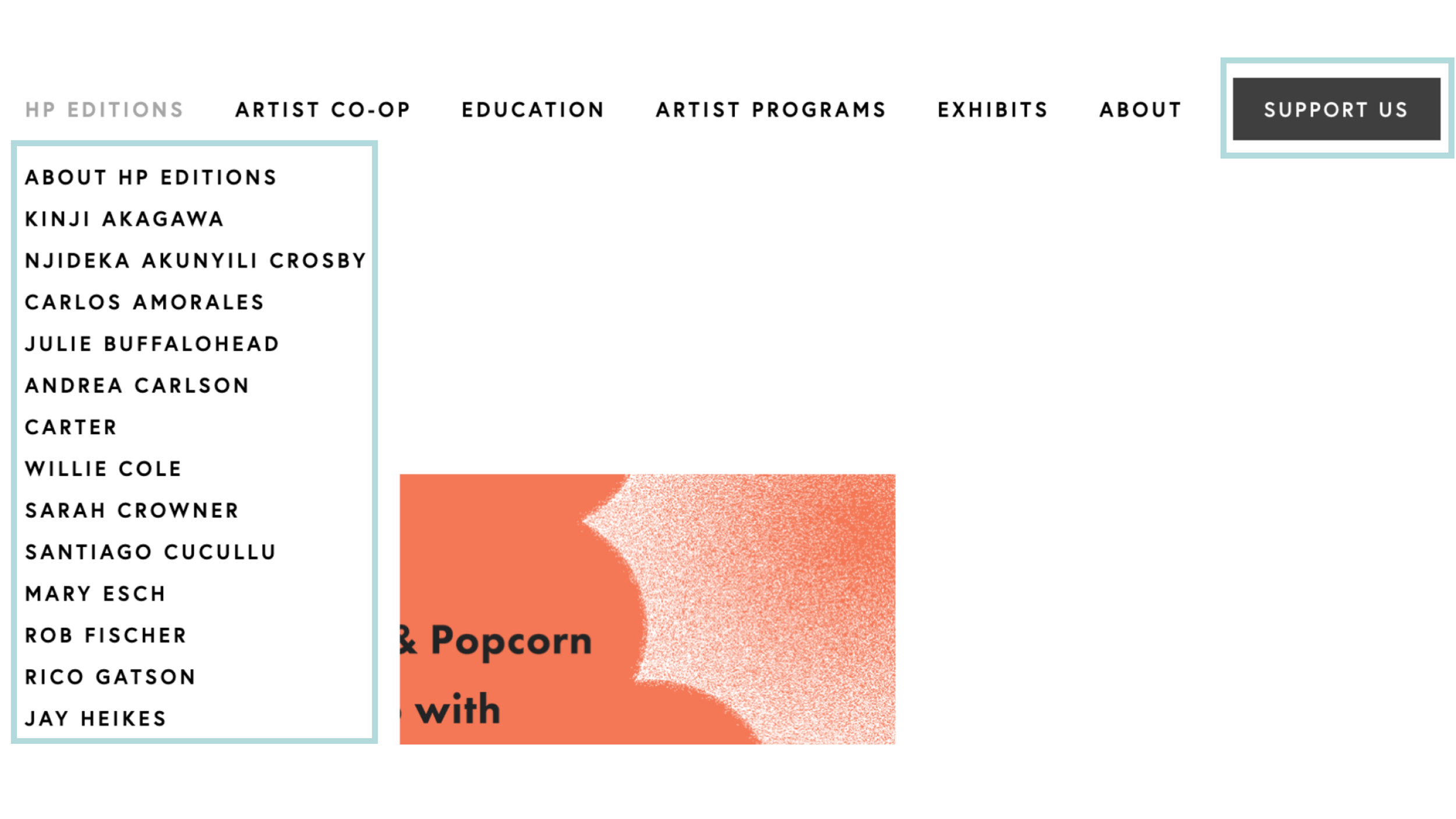

Solution: “Our Artists” was added to the “HP Editions” menu dropdown and “Support Us” was divided into two buttons.
Site Map

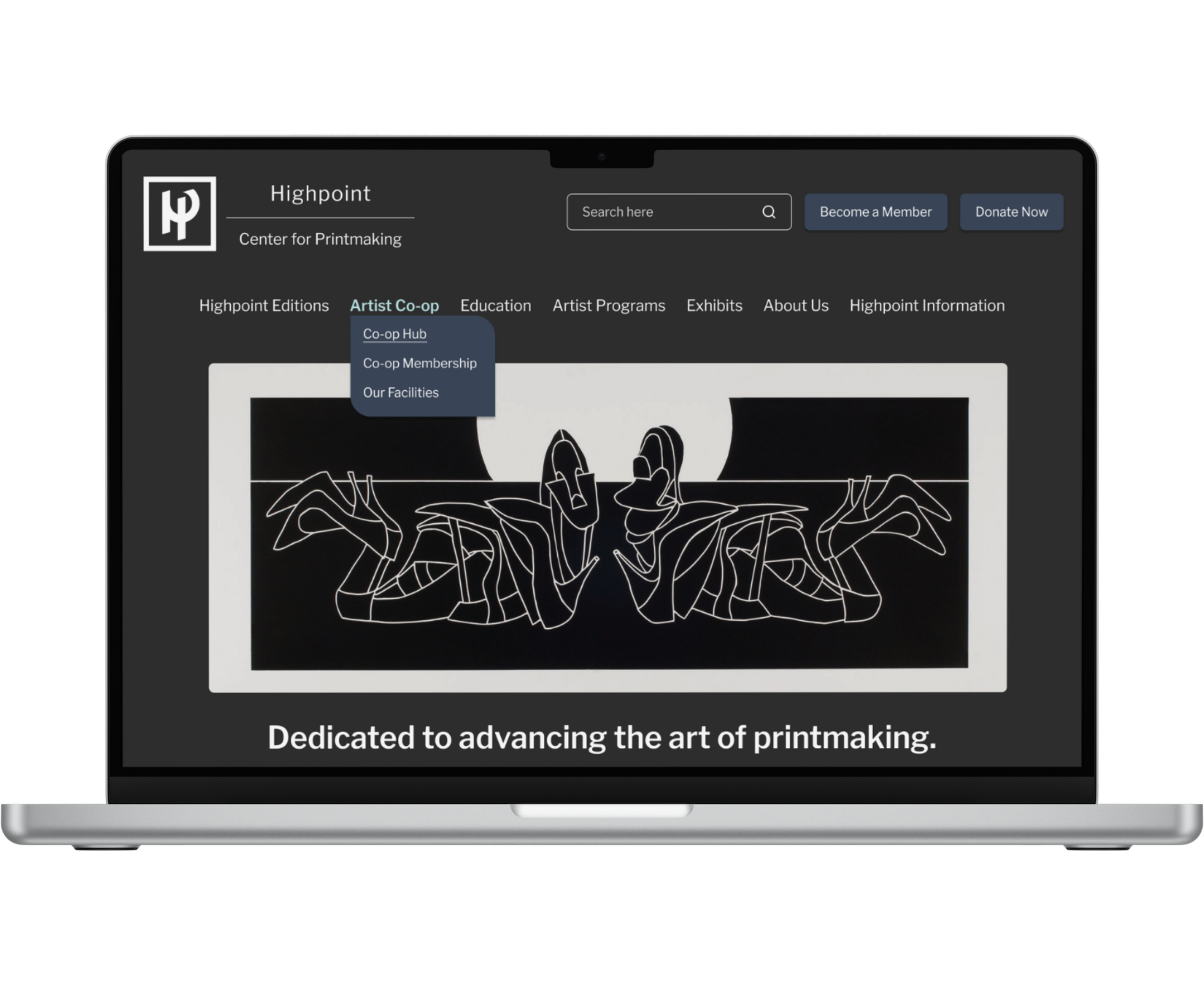
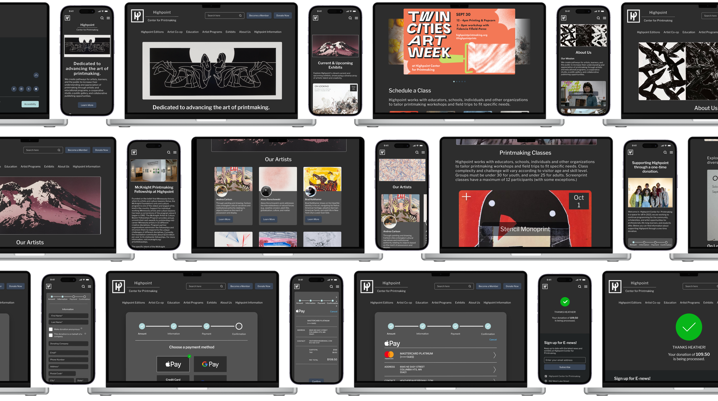
We took on the dark mode challenge, inspired by team member Ryan's suggestion, and adopted a 'mobile-first' approach to align with common user trends for Highpoint's website redesign.
Wireframes
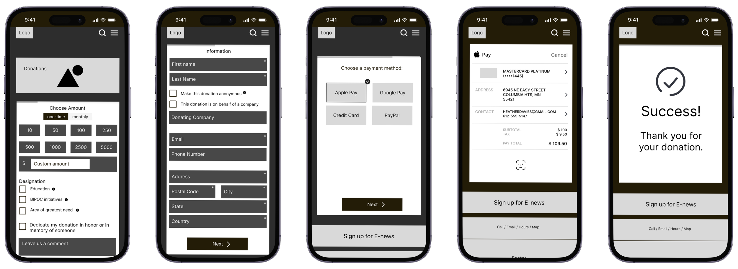
Mobile Donation Process
Three mobile and two desktop usability tests were conducted to identify user pain points in Highpoint’s website redesign.
Usability Test Goals
Discover what Highpoint’s “vibrant community” is about
Find information about “class 1”
Make a one time donation
Critique Session
The Critic’s Feedback
3/5 users
wanted to use the search bar to find classes
3/5 users
noticed that the navigation bar on desktop “jumped around” and wasn’t user-friendly

Iterations
As a team, we decided to refine the desktop navigation bar based on valuable user feedback. Our focus was on enhancing user clarity during menu category hover interactions.
We introduced a consistent and prominent hover state for all desktop buttons to improve the overall user experience.

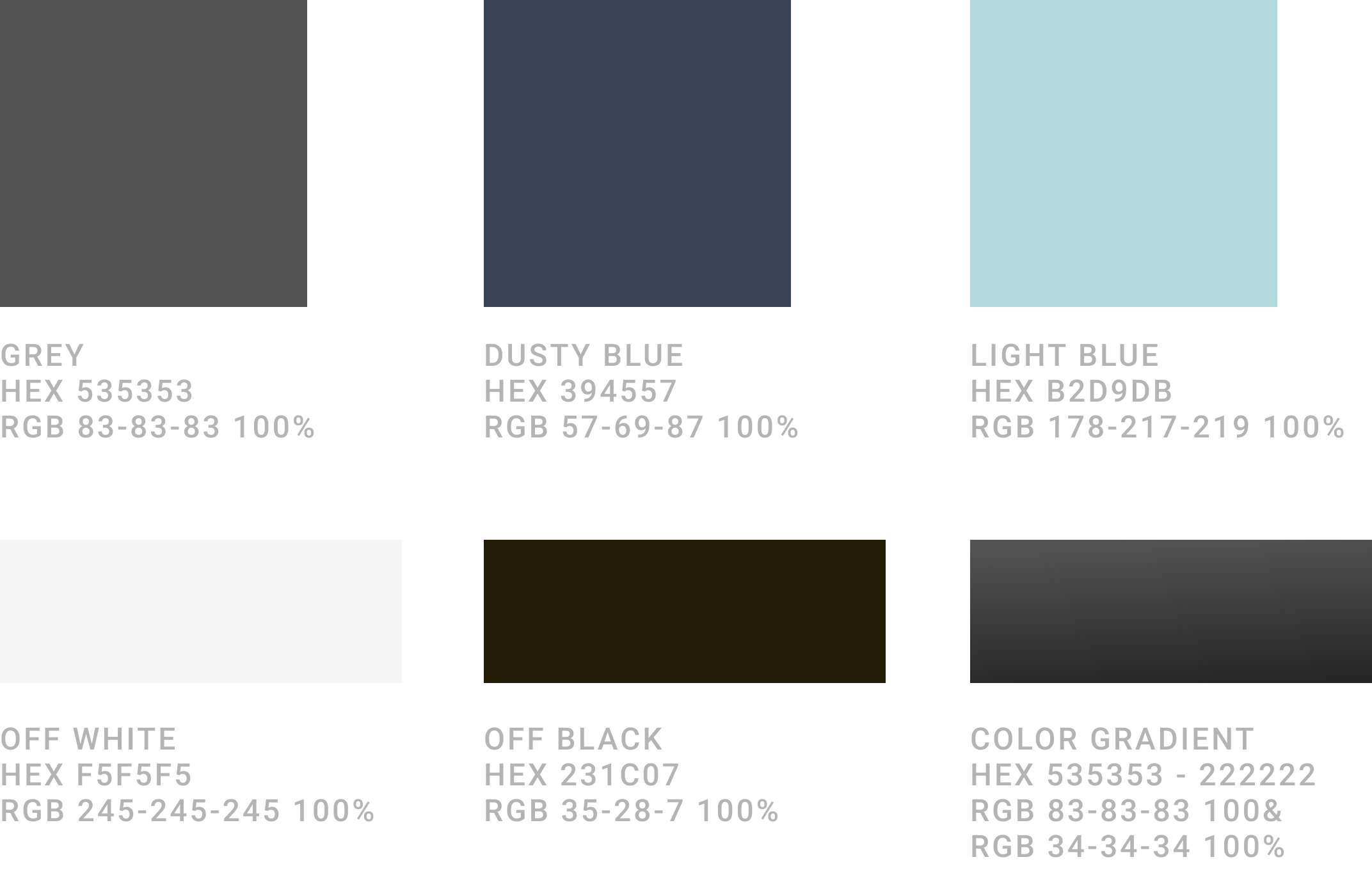
Our primary color palette consists of Off Black, Dusty Blue and Grey all of which pass the WCAG 2.0 guidelines for readability with off white text, #F5F5F5.
To further enhance the dark mode art galley aesthetic, we chose Light Blue and a grey color gradient as our accent colors.
Color Palette
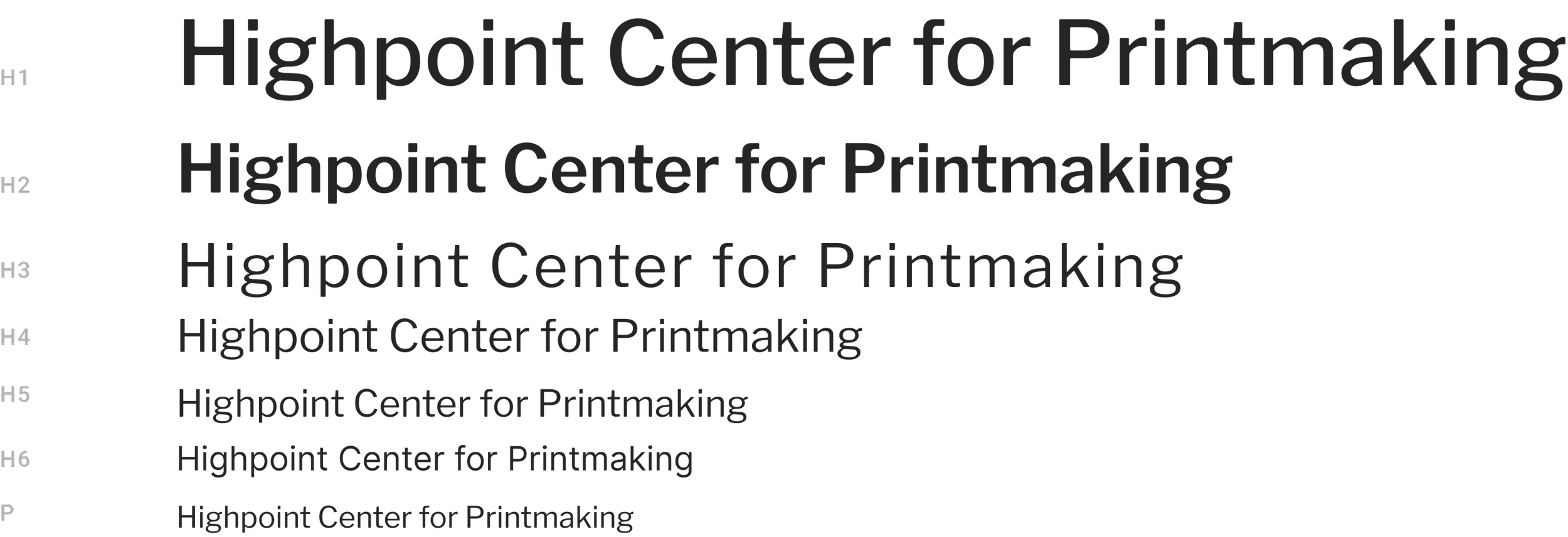
We replaced Highpoint's original bold, all-caps sans-serif font with the minimalist and readable Libre Franklin font, aligning with our art gallery aesthetic. This change follows a perfect-fourth modular type scale.
Typography
The Artist’s Debut
The Final Critique
For our final usability test, we placed emphasis on the redesigned mobile version of Highpoint's website, recognizing the prevalence of mobile as a primary platform for online interaction.
Two out of five users stated that there was inconsistency with text alignment in the website’s paragraphs.
We decided to iterate this by making all paragraphs have left aligned text to ensure the UI was cohesive throughout the site.

Maria P.
“I loved that you made a dark mode version of the site, I wish all sites had this option.”
Logan K.
“That was super easy to make a one-time donation!”
Highpoint’s Future Aspirations
Embracing the challenge of introducing a dark mode to the Highpoint Center for Printmaking redesign brought invaluable learning experiences, particularly in navigating the complexities of adhering to AWAG guidelines. It was crucial for us to avoid the pitfalls of creating a mere black-and-white website, as that would not embody a genuine dark mode experience.
In the future, our team’s goal is to:
Add a light mode, so users can choose their preferred mode
Add breadcrumbs to allow users to quickly go back to a previous page
It was crucial for us to avoid the pitfalls of creating a mere black-and-white website, as that would not embody a genuine dark mode experience. We value giving user flexibility and believe a light mode gives them just that.
Redesigning the Highpoint Center for Printmaking website has been a tremendous learning experience for me. I've deepened my understanding of component-based design, honed my skills in crafting intuitive navigation bars with responsive hover states, and embraced the 'mobile-first' approach as a fundamental design principle.
The challenge of implementing a dark mode further expanded my knowledge, pushing me to ensure it was a true embodiment of accessibility principles.
Throughout this process, my team remained committed to maintaining a minimalist art gallery aesthetic, which has reinforced my appreciation for brand consistency.
These collective experiences have not only enriched my design skills but have also paved the way for a more user-centric, accessible, and aesthetically aligned website for Highpoint Center for Printmaking.