Knowt
The Why Behind Knowt’s Redesign
Knowt is Quizlet’s biggest competitor in the EdTech space, yet many users are unaware of its key features, including Kai, the AI assistant. My goal was to make these AI tools easily accessible to all users.
Problem
Many users who sign up for Knowt experience difficulty finding and utilizing its AI tools, as these features are hidden within the current home screen design. This lack of discoverability leads to user drop-off, as users feel frustrated or uncertain about how to engage with the app's core functionalities..
Solution
To address this, the home screen must be redesigned to prioritize visibility and accessibility of AI tools, ensuring a seamless and engaging user experience that supports users in achieving their goals and encourages ongoing app usage.
-
Goal 1
Increase AI tool visibility by redesigning the home screen for easier access.
-
Goal 2
Boost user retention by improving usability to reduce drop-off.
-
Goal 3
Simplify navigation by streamlining the home screen for effortless interaction with AI tools.
Here are key user insights gathered from Reddit and Knowt's feature request page, highlighting feedback and pain points to inform the home screen redesign. These insights helped identify user needs and guide design decisions to improve functionality and engagement.
Knowt’s User Feedback
Studying Knowt’s Competitors
I selected Quizlet, Duolingo, Khan Academy, and Brainscape as competitors to evaluate how they approach key areas critical to Knowt’s redesign.
Key areas of focus:
Engagement & Motivation
Feature Discoverability
UI Design
Navigation & Intuitiveness
AI Integration & Personalization
I noticed that Knowt’s current Home Page was easy to navigate, however it was overwhelming and difficult to find Kai’s AI chat and AI tools. There was no mention of AI tools anywhere on the Home Page. This was important to note as the main goal of this redesign was to help users identify all AI tools.
Heuristic Evaluation
How might we redesign Knowt’s web home screen to make AI tools more visible and accessible, helping users stay engaged and achieve their study goals?
Prioritizing Features
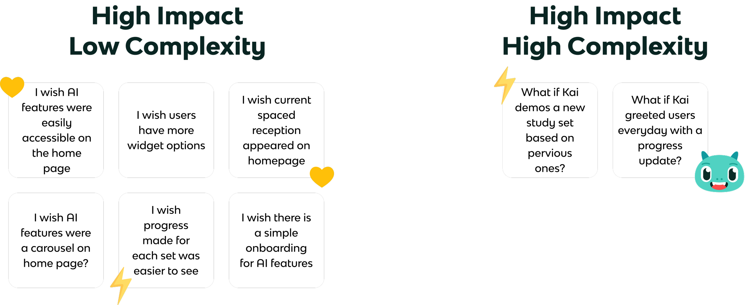
For Knowt’s Home Page Redesign, I used the “I Like, I Wish, What If…?” exercise to identify features that address the challenges users face. I prioritized features based on impact and complexity, focusing first on high impact, low complexity solutions to deliver immediate value, followed by high impact, high complexity features for lasting improvements.
Wireframes
Through thorough research, including competitor analysis and user feedback, I identified key pain points such as hidden AI tools. Prioritizing feature discoverability, intuitive navigation, and engaging elements like progress tracking, I developed low-fidelity wireframes that address these issues.
Say Hello to Kai, Knowt’s personal assistant!

Time to learn the why behind my design
User research revealed that many users wanted reminders and quick access to resume Spaced Repetition. To address this, I made it the first section on the home screen, featuring a personalized welcome from Kai to encourage continued studying. The suggested study deck is prioritized based on the upcoming exam date, but users can easily switch to a different deck using a dropdown menu of all decks currently in progress.
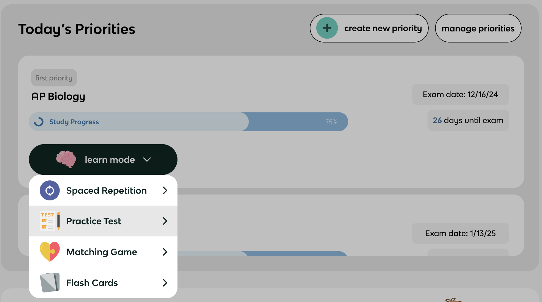
The second section, “Today’s Priorities,” displays all study decks in progress with a progress bar to motivate continued learning. Users can use the dropdown to switch study modes, and decks are organized by exam date priority.
The Practice Test button is currently showing the hover button.
After the priorities, users can easily access AI tools, addressing the current challenge of their discoverability. Clear, engaging wording encourages users to seek help from Kai. I also introduced the AI Syllabus Summarizer, a valuable new feature that automatically tracks your exam dates.
The AI Syllabus Summarizer button is currently showing the hover button.
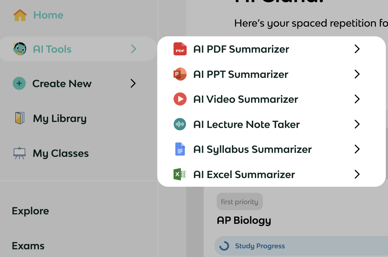
I simplified the navigation to a left-side nav bar, aligning with industry standards for accessibility and intuitiveness. Icons make menu items easy to identify, and I added a subnav for "Create New" and "AI Tools" that opens to the right, providing quick access to available options. Placing AI Tools below the home button ensures they’re easier for users to find while on all pages of Knowt’s website.
Wishes for Next Time
Due to time constraints, I wasn’t able to fully develop the new widgets bar, so I used the previous version, which isn't my preferred format, especially when it’s not collapsed. I didn’t make changes to the Folders and Files section because it seemed user-friendly, though there were comments on Reddit/Knowt Feature Requests about displaying full titles instead of ellipses. If I had more time, I would have explored this further.
My design decisions were based on assumptions from initial questions, as seen in my Figma file. With more time, I would conduct additional user research and testing to gather feedback. I would also consult with the Knowt team so that I can make the most informed decisions regarding the design.
Last Look
Redesigning Knowt’s current Home Page was a super exciting opportunity because I got to incorporate my passion for education with design. Finding users pain points with the current design allowed me to step into the users shoes and empathize with them. Doing so, helped guide me to this redesign. Truly this was one of my favorite projects despite the limited time given.
Now that I have had more experience within the EdTech field, I’d love to go back and visit this design again. I see great potential with Knowt and can’t wait to see what their future holds!


